A Baptismal Font for a Church: How to Choose One
A church has objects that are seen every day and not thought about until the need arises. The font is one of them. It may stand covered for years and then, in a single day, become the centre of the whole space: here a person is received into the Church, and everyone present looks at the water.
That is why a font is not chosen from a catalogue in passing. It must suit the manner of baptism accepted in the community, the place where it will stand, and the people who will prepare the water each time and then clear up. Form and material are secondary to these three things, even though they are usually what people discuss first.
This article is for the rector, the building committee and the donors. It does not replace a conversation with the priest, because the order and manner of celebrating the sacrament are determined by church tradition, not by the workshop. But it helps you come to that conversation with the right questions.
In brief
- The font is an object for the rite of baptism itself, not the holy water basin at the entrance.
- The manner of baptism determines the size: where immersion is practised, the font must be capacious; where pouring is used, it can be smaller and taller.
- The material, whether metal, stone or wood, is decided not only by beauty but also by whether the font is fixed or portable and how it is cleaned.
- The location, water supply and drain should be planned before work begins, not afterwards.
- All specific dimensions and the order of the rite are clarified with the priest and according to the church guidelines of your own tradition.
What is a font, and how does it differ from a basin?
A font is a vessel intended for celebrating the sacrament of baptism. The holy water basin stands at the entrance and serves the faithful: they take water from it. These are different things, although in everyday speech they are confused.
The difference in purpose leads to a difference in construction. The basin is a small object that can be placed on a pedestal in the narthex. The font must hold water for the rite, allow the priest to work with a child or an adult, and have a means of emptying.
Immersion or pouring: what the size depends on
The manner of baptism is the first thing to establish, because it determines which form will be suitable at all.
In the Orthodox tradition baptism is by full triple immersion, and this applies to infants as well. In the Catholic Church the Catechism calls triple immersion the most expressive way of baptism, but reminds that since ancient times triple pouring of water over the head has also been possible. For the Eastern Churches, the Catechism describes how the priest immerses the person being baptised in the water and raises him up at the invocation of each Person of the Most Holy Trinity. The Latin tradition mostly uses pouring, while Eastern Catholics usually baptise by immersion or at least partial immersion.
Historically the picture changed. The oldest fonts were built for full immersion, with steps leading down into the water. When mainly infants were baptised, fonts became smaller. The Catholic Encyclopedia links the spread of pouring to the 13th century and notes that the winter cold of northern lands hastened it. Modern Catholic guidance recommends that the font be large enough for adults and infants and allow different forms of celebrating baptism.
The conclusion for the client is simple. If your community baptises infants and adults by immersion, you need either two different fonts or one designed for both cases. If baptism is by pouring, a smaller font on a pedestal may suffice. Exactly how much water and what depth are needed is determined by the community’s practice, the priest’s height and convenience for those being baptised.
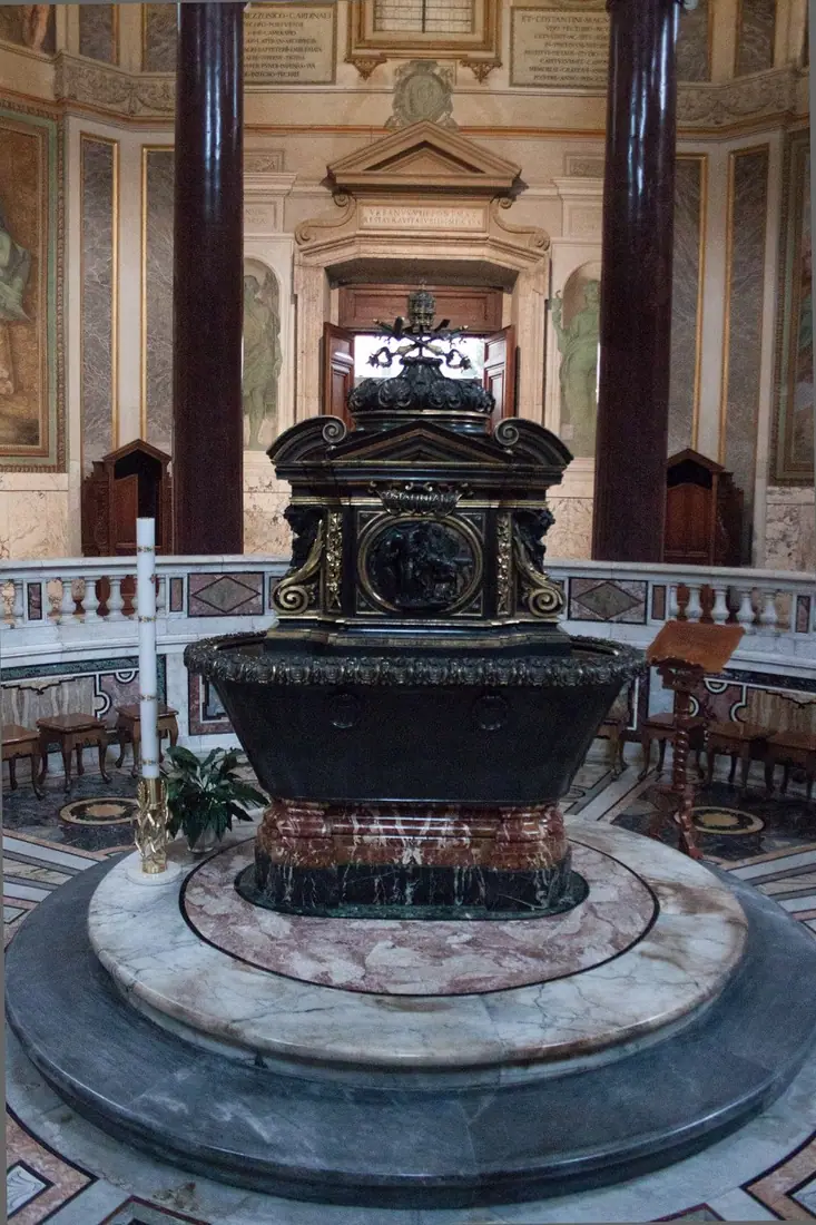
What forms are there?
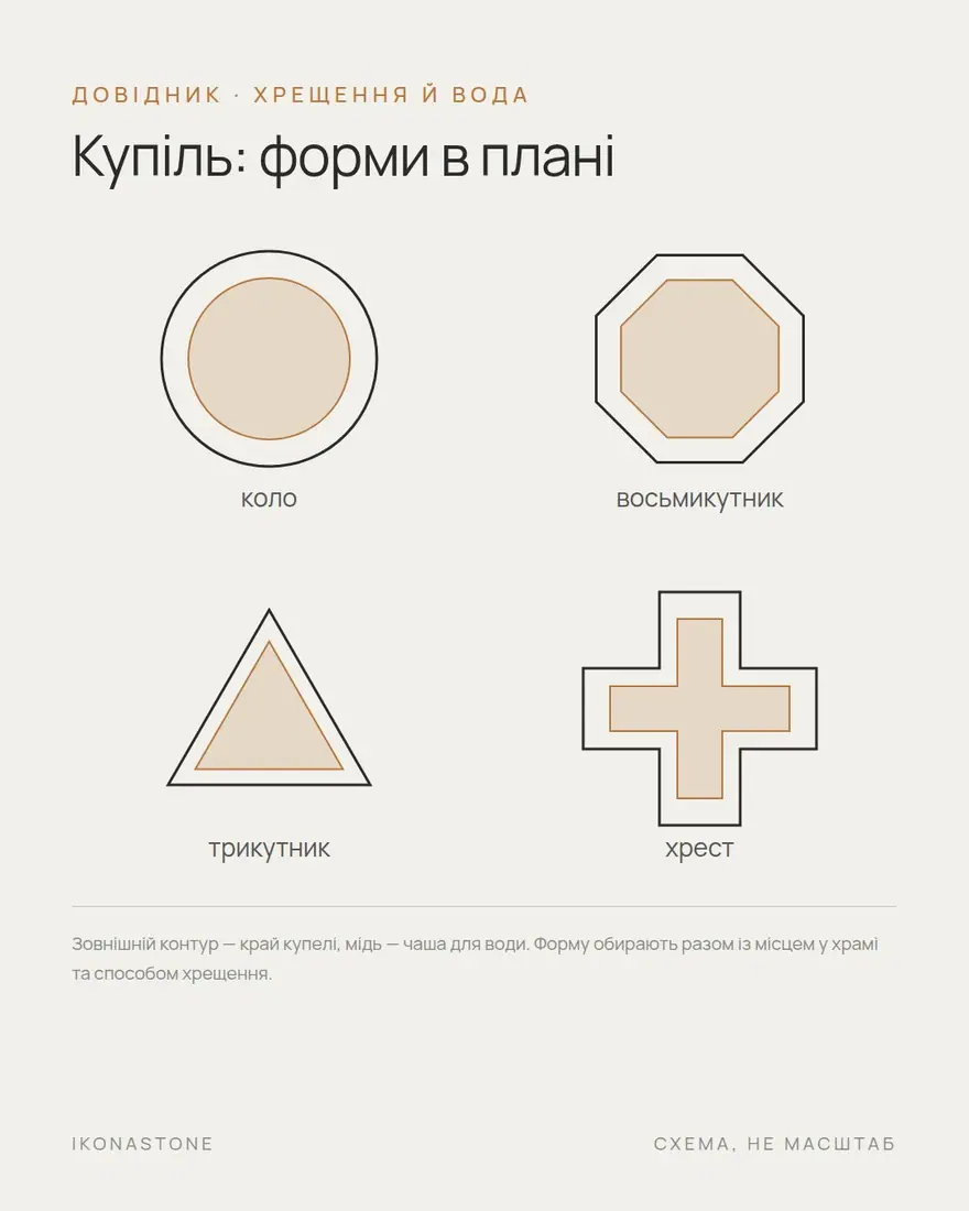
The form of a font is not accidental: behind it stands a theology shaped over centuries.
Many fonts have eight sides. The number eight is associated with the eighth day, the day of the Resurrection, and this symbolism goes back as far as Ambrose of Milan. Octagonal baptistery plans spread in Italy from the 4th century, and as the form of the font itself the octagon became established between the 13th and 14th centuries. There are also three-sided forms recalling the Trinity.
Catholic guidance describes the font as a symbol of both tomb and womb: in the water a person dies to the old life and is born to the new.
A separate tradition is the chalice-shaped font. In Orthodox practice large fonts often take the form of a chalice, and many of them are portable. Chalice-shaped fonts are also known in the Western tradition, for example the English Aylesbury fonts of the late 12th century.
The difference is easier to explain like this:
| Form | What it emphasises | Where it is appropriate |
|---|---|---|
| Round | A simple, ancient form | For a basin and a fixed font |
| Octagonal | The eighth day, the Resurrection | Fixed, in stone or metal |
| Three-sided | The Trinity | Smaller forms, emphasis on the symbol |
| Cruciform | The cross | A rare ancient form, more often in the East |
| Chalice on a stem | The chalice | Fixed on a pedestal or portable, stone or metal |
Metal, stone, wood: an honest comparison
There is no single best material. Each has strengths and weaknesses, and it is better to know them in advance.
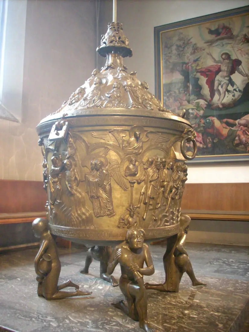
Metal. According to OrthodoxWiki, fonts are usually made of metal. It is light, holds water well, suits portable basins and is easy to clean. An example of craftsmanship is the bronze font of Hildesheim from the early 13th century: about 1.7 m high, 96 cm in diameter, decorated with scenes from the Old and New Testaments. Weak points: the surface needs care, and in a cold building metal quickly passes its cold to the water.
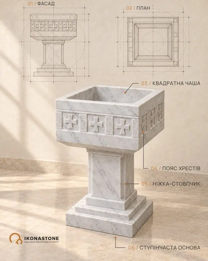
Stone. The Catholic Encyclopedia describes the font as usually an ornamental stone vessel, although metal and wood are also used. Stone creates a fixed, durable volume and combines well with other stone elements of the interior. But stone is heavy: a font needs a solid base. The choice of stone and the surface treatment are needed so that the stone does not absorb water. Stone also holds cold for a long time.
Wood. According to the Catholic Encyclopedia, simple fonts, particularly in the East, were sometimes made of wood; old rules required that a font not made of stone have a metal lining. Wood is warm to the touch, light and affordable, and suits wooden churches well. However, it requires reliable internal waterproofing, is sensitive to moisture and temperature changes, and in the long run needs more care.
| Material | Strengths | What to consider |
|---|---|---|
| Metal | Lightness, portability, the familiar basin | Care of the surface, cold water |
| Stone | Durability, a fixed installation, unity with the church’s other stone | Weight and base, cold, quality treatment needed |
| Wood | Warmth, simplicity, affordability | Waterproofing, care, sensitivity to moisture |
Where should the font be placed?
The traditional place is closer to the entrance, because baptism is the entrance into the Church. Catholic guidance states plainly that the font should be visible and accessible to everyone who enters, and that near the entrance it is also convenient for the sprinkling at funerals.
In antiquity separate baptisteries were built for this. The Lateran Baptistery in Rome is considered one of the oldest church buildings still standing today. Baptisteries usually belonged to cathedrals rather than parish churches. For a modern parish church this may be a separate niche, the narthex or a small chapel at the entrance.
Modern Catholic guidance also recommends placing the font and the altar on one axis, showing the link between baptism and the Eucharist through a common material or light. This is easy to achieve where both elements are made of the same material.
Water and drainage
Water is the central image of baptism. The ancient text of the Didache advises baptising in running water, and in its absence in other water, and if there is none of that either, pouring water on the head three times. Catholic guidance recalls this tradition of running water and recommends considering it in the design.
In practice this means two questions: where the water comes from and where it goes. Historically water was taken from springs or pipes and drained away after the rite. The Catholic Encyclopedia mentions fonts with two compartments: one for the baptismal water and a separate empty compartment into which the drops ran; older fonts had drain pipes. The drain should be agreed with the priest: in what way and to what place the water will go.
About heating we will say only this in general terms. For infants baptised by immersion, the water temperature is a matter of care, especially in the cold season. How it is provided (a hot water supply, a mixer tap, a separate heater) is decided with the designer, not improvised on site.
The cover and care
A font is usually covered. The Catholic Encyclopedia notes that medieval rules required a tight-fitting cover, and many fonts also had ornamental canopies. The reasons are obvious: the water does not evaporate and does not become dirty.
The cover needs to be convenient: it must not be made so heavy that one person cannot lift it. This is a small detail, but it determines whether the font will remain usable.
What to decide before ordering
- The manner of baptism. Immersion or pouring, children and adults together or separately. This determines the size and construction, and a conversation with the priest cannot be avoided here.
- Fixed or portable. For a portable font a metal basin is enough; a fixed font needs a base and a place.
- Location. Narthex, niche, a separate chapel or a dedicated corner. Check that there is enough space for the rite, the priest, those being baptised, the godparents and the guests.
- Material. Metal, stone or wood; coordinate it with the rest of the interior and with whoever will look after it.
- Water. Where it comes from, how it is filled, whether heating is needed.
- Drain. Where the water goes after the rite, and how this has been agreed with the priest.
- Cover. Material, weight, how it opens and closes.
- Floor and base. Stone and water are heavy, so the base is built into the design.
- Symbolism. Form, inscriptions, relief: which images are appropriate in this church and whether they conflict with the other decoration.
- Who is responsible. Who accepts the work from the workshop, who will look after the font, who takes charge of the water and the cleaning.
A final thought
When a church is being built, it is easy to leave the font until the end: other parts of the interior claim the attention. But it is at the font that a person is received into the community, and it deserves the same careful planning.
IKONASTONE makes stone fonts and basins to the design of the church; you can read about them in the fonts and basins section. Related topics are covered in the articles The stone iconostasis and The altar table and the table of oblation, and the question of the baptistery and the font in more detail in the article The baptistery and the font.
Not sure what the piece is called? Walk through the church from sanctuary to churchyard →
Would you like to give something to a church? What to give a church →
Want to remember loved ones or a fallen parishioner? Remembrance at a church →
FAQ
How does a font differ from a holy water basin?
The holy water basin stands at the entrance and serves the faithful: they take water from it or make the sign of the cross. The font is intended for the sacrament of baptism itself: the priest performs the rite in it or over it. These are different objects with different sizes, heights and water supply.
Must a font always be large enough to immerse a person?
No. It depends on the tradition and the practice of the community. In the Orthodox tradition baptism is normally by triple immersion, even for infants. In the Catholic Church the Catechism calls triple immersion the most expressive way, but also recognises triple pouring; in the Latin tradition pouring is the common practice.
Which material is best for a font?
There is no single answer. Metal is light and convenient for a portable font, stone creates a fixed and durable volume, wood is warm and simple but requires reliable internal waterproofing. The choice depends on whether the font is fixed, how it is cleaned and who looks after it.
Where in the church is the font placed?
A common solution is closer to the entrance, because baptism is the entrance into the Church. Catholic guidance recommends that the font be visible and accessible to all who enter. In antiquity separate baptisteries were built for this; in modern churches it may be a separate corner of the narthex or a small chapel. The final location is agreed with the priest.
Does a font need a drain?
In practice, yes: the water has to be removed somehow after the rite. Historic fonts had drain pipes or separate compartments for runoff. Exactly how to arrange this should be discussed with the priest and the designer before work begins.
Can a font be ordered while the church is still being built?
Yes, and it is more convenient. Then the place for the font, the water supply and the drain are built into the design rather than fitted into a finished interior.
Sources 8