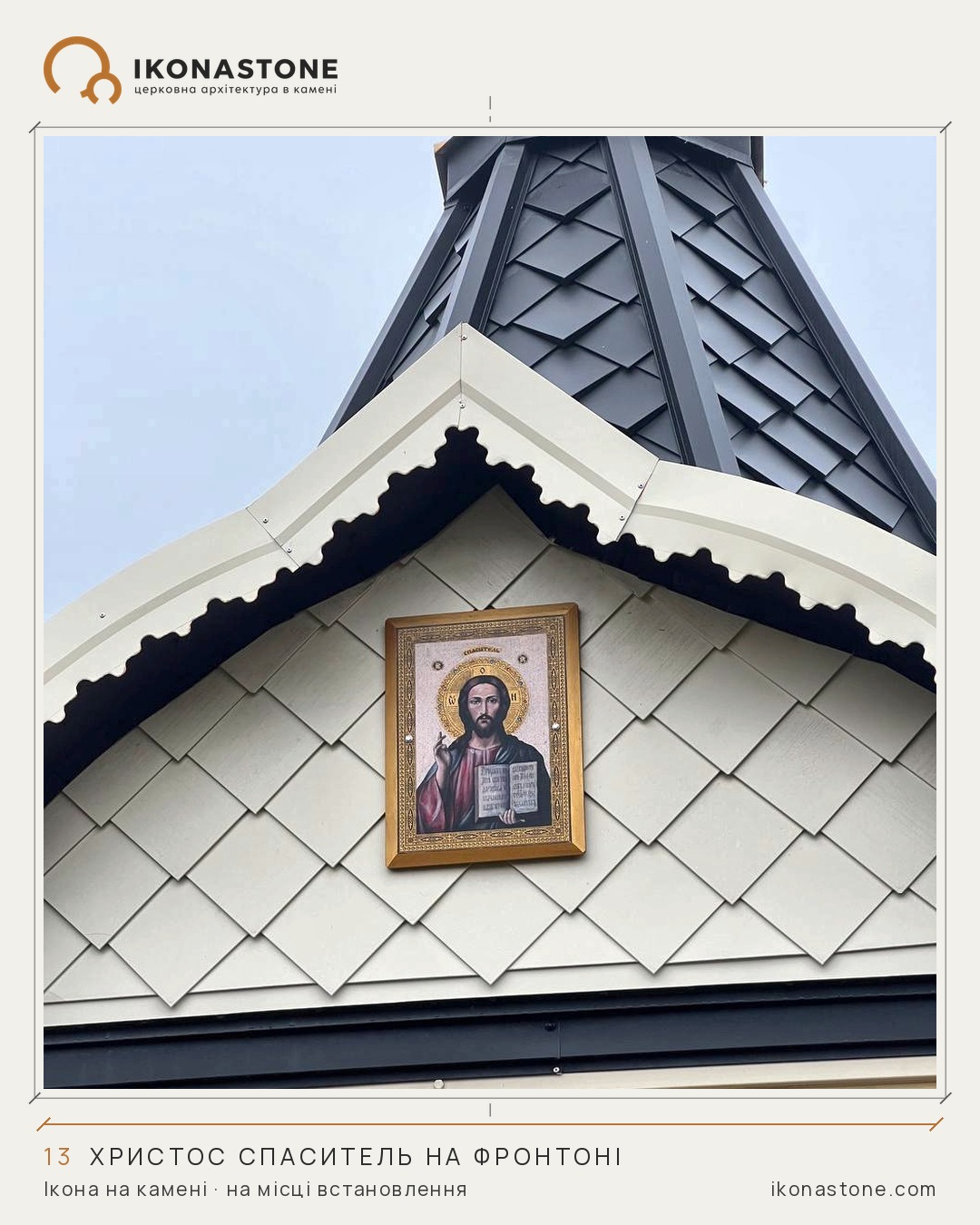
An icon on a façade: what a person sees from the ground
An icon inside a church is viewed at arm’s length. An icon on a façade is seen from the gate, from the pavement, from a bus window. It is the same image, but a quite different reading.
On the drawing, a façade icon looks calm: a rectangle or an arch, proportions, margins. On site everything changes. The viewer stands below and the eye travels upward. The higher the image, the more it is “compressed” vertically, and small details merge into a blur.
The inscription is the first to go. Thin letters that read flawlessly on the drawing turn into ornament from a few dozen paces. So the size of the image and the height of the letters are set not by a sheet of paper but by two figures: the height at which the icon will be, and the place from which it will most often be seen.
The second matter is light. A façade lives under sun, rain and the shadow of the cornice. A gold ground holds the eye from afar; fine painted detail does not. A niche or a projection above the image casts a shadow and protects the stone from direct rain.
The third is the stone itself. In winter, water that has got into the pores of the stone freezes and expands, and this happens many times in a season. For a façade this is a question not of aesthetics but of durability.
The simplest check we recommend before fabrication is to print the sketch at full size and raise it to the intended height. Half an hour by the gate tells you more about scale than any visualisation.
If you are planning an icon for a façade now, send a photo of the gable and the approximate height, and we will advise on the size of the image and the inscription.